By: Julie Baer, IIE Research Specialist; Evgenia Valuy, IIE Evaluation and Learning Specialist; and Jaime Tanner, IIE Data Analytics and Visualization Specialist
Today on Capitol Hill, data visualization connoisseurs, enthusiasts and practitioners are gathering to recognize the first annual International Chart Day. The event celebrates the history of data visualization, ethical design practices, and the importance of truthful data graphics.
At IIE, we join in the celebration by examining the important role that charts and graphs play in our work on the research and evaluation teams at IIE’s Center for Academic Mobility Research and Impact. Our teams contribute over 15,000 data points in each Open Doors® report, carried out by IIE in partnership with the U.S. Department of State’s Bureau of Educational and Cultural Affairs, along with the numerous findings from evaluation reports to provide the field with the most robust information on international student and faculty mobility as well as the impact of international exchange, leadership, and scholarship programs in education.
Creating accurate and compelling graphics to inform the public about trends in international education has long been a part of the IIE story. As a leader in this space, it is crucial that we impart this information clearly and effectively. Read on to learn more about how our teams communicate data
with appropriate
visualizations to convey
actionable
insights to key audiences.
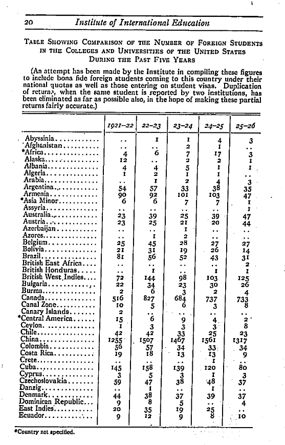
Figure 1. “Table Showing the comparison of the number of Foreign Students in the Colleges and Universities of the United States During the Past Five Years, 1921/22 – 1925/26.” The Institute of International Education Seventh Annual Report of the Director, 1926.
Graphic displays of information have been a part of IIE’s research dissemination since our founding in 1919. IIE displayed data on the number of international students studying in the United States in a simple table format from 1921 through 1948 in our annual reports. While these tables are useful for certain audiences and can still be found on our website, IIE has also expanded the ways that we visualize and present information to include charts, graphics, maps, diagrams and interactive tools that help to highlight patterns within the data
Throughout the years, our teams have remained committed to providing readers with data visualizations that follow best practices and use innovative techniques that help our audiences explore the data, analyze trends and relationships, and provide further insights to the field.
Mapping International Students “From the Four Corners of the Earth”
With the stand-alone publications of Education for One World and the Open Doors® Reports beginning in 1948/49, IIE began to use maps to illustrate patterns of international students coming to the United States in order to present mobility data in a new and compelling manner.
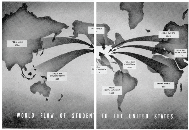
Figure 2. Map of “World Flow of Students to The United States” from the chapter “From the Four Corners of the Earth: Where They Come From.” Education for One World, 1948/49.
In the late 1940s, IIE displayed artistic, water-colored maps that showed regional international student flows. These images, often sparsely and decoratively placed throughout the publication, gave readers a visual break from the text heavy report. Indeed, the map seen above was the only visual representation of data in the entire publication, and it was placed in the center-fold of the book – a place of prominence for readers to see the information displayed pictorially.
Some graphics from the 1980s showed pixelated cartograms which distorted country size based on how many international students came to the United States from each place of origin. This 1980/81 chart below is among the favorites of our research team as it was a unique way to quickly impart data. While presented in a small format for this blog, in the Open Doors printed report the two-page spread makes it easy to interpret that Iran (what appears here as the central dark square) sent the most international students to the United States during this time.
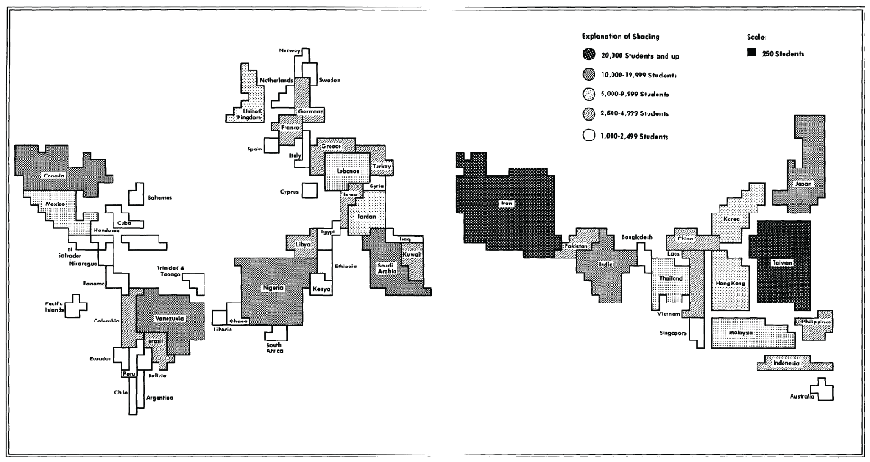
Figure 3. Cartogram of “Countries & Territories with more than 1,000 Students Reported, 1980/81.” Open Doors 1981/82 Report on International Educational Exchange.
Today, IIE continues to drive innovation in how international student data is charted – moving from static maps to interactive visualizations that offer readers more opportunity for independent exploration. Interactivity also gives us the technical ability to toggle between views that highlight different stories within the same data.
As an example, in the choropleth map below the reader immediately sees that China sends the most international students to the United States (one-third) as it is the most visually prominent place of origin on the map. Because the map is interactive, readers can access data on even the smallest places of origin, such as Lesotho or Dominica, that had never been mapped in our print publication. In the second view of the map, available through the toggle function, readers can see the same data on a different scale that creates more visual contrast between the various places of origin.
What’s in a chart?
What do we consider when planning to visually present data? We often reflect on three key factors:
- The audience of the chart determines its complexity and the amount of information presented.
We ask ourselves: Who will read the chart? What is their familiarity with the topic and ability to read data? What do they need to take away from the chart? How will they use the data? How much time will they have? - The purpose of our visual is to communicate the findings as they pertain to the research or evaluation goals.
We ask ourselves: Is there a finding that we want the end-user to see? Do we even need a chart? How can we best convey the finding visually? Do we want to encourage any action? - Considering potential interpretations of the graphic helps to convey the message clearly and in the best format.
We ask ourselves: Is a particular chart the best chart to represent the data? What actions can result from it if we present it that way? Can the chart be misinterpreted and lead to negative consequences?
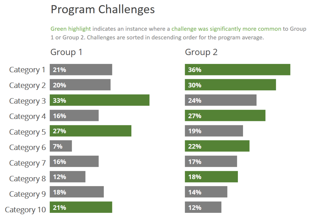
Figure 4. Anonymized chart.
Our intended audience of the graph presented above was a program manager who had little time to review data but needed quick interpretation to make decisions. Our purpose for using this graphic was to show efficiently the areas that required attention and intervention.
Our team decided to use a horizontal bar graph because bars are a familiar graphic element to many people and are easy to compare vertically among categories. We chose a small multiples graph instead of overlapping bars to discourage immediate comparison between the two groups. This way, the reader could easily see the challenges unique to each group. For example, you can easily see that Group 1’s greatest challenge is Category 3, while Category 1 is the primary challenge for Group 2. We used the client’s logo green color against a neutral color (gray) to focus the reader’s attention. Finally, we included the key finding and quotes (not pictured here) to contextualize the graph for our audience.
IIE’s Commitment to Charting What Matters (and doing it well!)
There is no doubt that we live in a data-driven world where we must often make actionable decisions based on the best information available. Charts and graphs are powerful tools that can quickly and efficiently provide insights. However, while data visualizations can help people understand the world around them – they can also lead to confusion if not thoughtfully designed. The quality and design of charts and graphs matter as they have the power to significantly influence a reader’s conclusions.
We join today’s first ever International Chart Day celebration to recognize the importance of creating meaningful visualizations and charts to convey information and findings. We remain committed to regularly evaluating our design practices to not only ensure that our audiences are to able to engage with the data, but to also facilitate an understanding of the current trends and impacts of international education.